


Dear ATUF Girl,
Look, it’s not you, it’s us. Things just aren’t working anymore. We’re sorry to say that we’ve been feeling like this for awhile now. But hey, we’ve had a good run…two years. I think that’s something we can all be proud of. 
You can’t say you didn’t see this coming…it’s not exactly like you’ve been faithful:
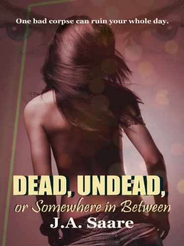

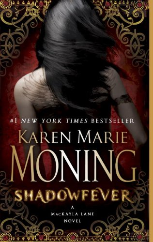
We didn’t set out for this to happen. Honest. It’s just that we met someone. We started talking and she had some amazing ideas and we couldn’t help it, we were tempted. More than tempted. Anyway, one thing let to another, and well, this is what we need right now. We hope you aren’t hurt by this. And we know things may be a bit bumpy here while we adjust, but we wouldn’t be doing this if we’d didn’t think it was the best choice for all of us. We know you’ll find something else…in fact maybe you already have. We just want you to be happy like we are happy.
With fondest memories,
Abigail & Julia
--------------------------
So what do you think of our new design?
Tawni from Forever Blog Design is the brilliant lady responsible and we just love the updated look she gave us (Thank you, Tawni!). The layout is almost identical to our previous one so you should be able to find everything without too much confusion. We’ll be tweaking things over the next few days so please be patient if things don’t look perfect right away. If there is anything you don’t like or any suggestions you have PLEASE LET US KNOW and we’ll try to address them along with the other little changes we’ll be making.

Also, be sure to check in tomorrow for one last BIG change to ATUF…our new blogger, Kristina!







Love, love, LOVE the new design!
ReplyDeleteLOVE IT. When you asked us to fill out the survey and what we'd like to change or what we loved about ATUF the only thing that came to my mind was a theme-change. Damn, does that new one look good. Now I'll spend even more time reading your old (and obviously also the new) reviews. <3
ReplyDeleteOoh! Super chic! I love your design and your intro post breaking-up with the ATUF girl is cute!
ReplyDeleteI love it. It looks amazing and I agree with Carmel I love the whole breaking up with ATUF girl bit.
ReplyDeleteVery nice.....a great upgrade!
ReplyDeleteI loved it before (and noticed right away the same pic on Shadowfever) but this looks really good!
Love the new look!
ReplyDeletelove the new design, but your header is a wee bit too dark. The title doesn't "Pop" anymore.
ReplyDeleteThe new design is lovely.
ReplyDeleteOh, wow! The new design is amazing.
ReplyDeleteI love the new design!
ReplyDeleteWhen I first seen the new design posts in the dashboard I was like no! I really liked the old one and was curious to see if it could top it! And it did! I LOVE THE NEW DESIGN! I think I will always love the old one as well! BUT I LOVE THIS ONE! =DDDDDDDDDDDDDDDDDDDDD
ReplyDeleteI really like the new design!
ReplyDeleteNot sure if it has anything to do with design at all, but this site now takes SO long to load & is prone to causing browser to quit working (I think it may have started when you changed the format- not having the whole post on the main page).
Not sure it something that an be helped/changed as part of the new design, but thought it might be helpful for you to know.
Again, not sure if can be helped/changed, but it is also impossible to comment non-anonamously for me (and I am able to do so on other blogs).
Love the new layout!
ReplyDeleteThanks for all the comments, I'm glad you guys like the change! Also, I appreciate input on what's working and what isn't, it's helpful to have additional eyes looking for bugs or things we need to fix.
ReplyDeleteIf anyone is reporting an issue, could you also let us know what browser you're using? That will help us try to re-create the problem.
Love the new design! Looks great! :-)
ReplyDelete*side note on design: when I view on my iPod touch in mobile version, the "old" banner shows up. I have to switch to web version to see the "new" look, Just FYI :-)
Hehe...great new design. I love the simplicity, but it is also very attractive to the eye.
ReplyDeleteI'm giggling at the goodbye letter to ATUF girl. :)
ReplyDeleteAmber, Yep. I noticed that in mobile too...I think it just hasn't been refreshed by blogger yet, but I'm looking in to it. Thanks for letting us know.
ReplyDeleteThis is awesome I love it!
ReplyDeleteLooks great!
ReplyDeleteThe new design looks awesome. I'm sure the ATUF Girl will move on and find plenty of other people.
ReplyDeleteI saw the old design then I went to an older post and the graphics changed and I was like Holy Crap what just happened?
ReplyDeleteThen I was all OH they changed it! Cool!
The new design is great! I saw her on a hair straightener ad and almost laughed out loud in the salon. That ATUF girl gets around!
ReplyDeleteI like it =) Clean, sinple, to the point!
ReplyDeleteAwesome new design! And I love the goodbye to the ATUF girl. :D
ReplyDeleteIt looks fabulous!
ReplyDeleteLove it! LOVE IT!
ReplyDeleteOMG I LOVE IT!!!! (Sorry, I'm totally obsessed with the full moon.) It's amazing! I loved the old one, but I like this one even more! :D
ReplyDeleteLove the new design!
ReplyDeleteMay have had a heart attack when I opened it up. Once I got over that, I do like the simplicity though.
ReplyDeleteMinor annoyances: Can't open post in new tab, only new window (Can still open everything else in new tab - eg Contact, Recent Posts). It is also loading slowly for me, as someone mentioned upstream. Not as slowly as it seems for them, but noticeably (using Firefox).
I love the design, it's so much smoother. I am also having trouble loading pages.
ReplyDeleteLove the new design. I can still find everything easily and the colors are great.
ReplyDeleteLove the new design, just having problems uploading the site now. I have highspeed, but when I'm on here it feels like I'm on dial up. Not sure if it's just me with this issue, other than that, I love it!!
ReplyDeleteGreat day today. I had news exact search from you site. I really impress to read that article. I openly I said your site will go in peak.
ReplyDeleteI really like the new design, It's easier to read the text with this color palette. My only issue is with the banner, the colors don't have enough contrast for text, I think. I have vision problems ands is really hard for me to read the "where para is normal", it doesn't pop up, maybe it would be better in a lighter grey? But I really love the rest :D
ReplyDeleteThis comment has been removed by the author.
ReplyDeleteLove. Love. Love it!!!
ReplyDeleteThis comment has been removed by the author.
ReplyDeleteI love the new look. Well, I'll be honest, I'm not crazy about how big the header banner is, but it is fantastic. *grin* I just don't like having to scroll to see the content.
ReplyDeleteThis new design is wonderful. It feels clean and moody and fun.
ReplyDeleteI like it!
ReplyDeletePabkins @ Mission to Read
Love the new design! It looks great!
ReplyDelete