


|
Not Yet Available for Pre-Order. | Description: She should have run. Now, she’ll have to fight. Eighteen year old Birdie may be homeless, but she’s surviving, that is until a mysterious guy throws money in the air like a crazy game show host, and she grabs some with the idea she’ll be able to buy dinner that night. In that singular moment, unassuming Birdie becomes the girl in everyone’s viewfinder. Thugs want to kill her. Money-guy wants to recruit her. The very hot, very rich and very out of her league, Grey Mathews, wants to save her. Birdie, though, wants nothing to do with any of them, until she realizes fate didn’t bring them all together. Now, with only twenty-one days left, she’s got to decide whether to follow in the footsteps of those before her or risk her life for people she’s only just met.
|

|
|
| Julia’s Thoughts | Abigail’s Thoughts |
| I love the graphic novel look, Birdie looks like a super hero on this cover. Eye-catching and effective, though I’m not sure if anything other than the hoodie sounds like the urban description. | I like the composition, but stylistically, it looks like a graphic novel cover, and it's not a graphic novel |

| |
| N/A |

|
| Description: N/A
|


|
|
| Julia’s Thoughts | Abigail’s Thoughts |
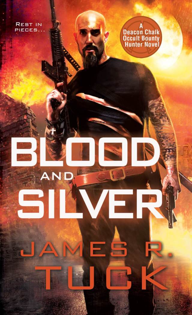
| Deacon’s all about the accessories, belts and firearms. Love that they kept this distinctive cover model and style, and I particularly like his posture on this one. | Wicked cool. Deacan looks like a modern day Rambo. |
| |
|
|

|
| Description: Anna and Bennett were never supposed to meet: she lives in 1995 Chicago and he lives in 2012 San Francisco. But Bennett’s unique ability to travel through time and space brings him into Anna’s life, and with him, a new world of adventure and possibility. As their relationship deepens, they face the reality that time might knock Bennett back where he belongs, even as a devastating crisis throws everything they believe into question. Against a ticking clock, Anna and Bennett are forced to ask themselves how far they can push the bounds of fate—and what consequences they can bear in order to stay together. Fresh, exciting, and deeply romantic, TIME BETWEEN US is a stunning and spellbinding debut from an extraordinary new talent in YA fiction.
|

|
|
| Julia’s Thoughts | Abigail’s Thoughts |
| Ethereal and romantic, this cover compliments the description despite not having any overt paranormal elements. | Soft and pretty, if a little simple. The colors are lovely. |
| |
| N/A |
|
Not Yet Available for Pre-Order. | Description: Face the past or look to the future? Both will hurt. One could kill her. All her life, Lily Crane has suppressed her childhood memories, masking the signs of abuse with a variety of looks. From brunette to blonde, tall to short — as a Mimic, changing shape is her gift. Her right. Her achilles heel. It’s Lily’s latest likeness, chosen simply by accident, which threatens to repeat a history she’s desperate to forget. Worse, she must do so without the one man who takes all her pain away: Cael Aldridge. Cael has no intention of leaving Lily on her own. He never has. Now, with the woman he loves in the hands of a predator who wants Lily for her genetics, Cael will do everything he can to bring her home. Alive. He can only pray he isn’t too late.
|

|
|
| Julia’s Thoughts | Abigail’s Thoughts |
| Creepy and heartbreaking, though not particularly paranormal. This could fit any any ballet, debutant, YA drama. | I like this, but I'm not sure how well it suits the story. The title text is flapper/vintage to me, but I think the story is contemporary. The actual image is strong, and does lend itself to the abusive story line, but that's why it's off putting. |
| |
|
|

|
| Description: Life can be stitched from scratch. The lost can be remade. And Eva, a teenage girl, is forced to choose between her world and the world of the girl she was created to replace.
|

|
|
| Julia’s Thoughts | Abigail’s Thoughts |
| Filling her silhouette with ruins and architecture is very disorienting and ominous. I like the trippy vibe, but I would like to see more of a description. | Very cool. The transparent/overlay fits perfectly with the description. |
| |
| N/A |
|
| Description: Having had no choice but to use her power has a necromancer to save Russia from dark forces, Katerina Alexandrovna, Duchess of Oldenburg, now wants to forget that she ever used her special powers. She's about to set off to pursue her lifelong dream of attending medical school when she discovers that Russia's arch nemesis--who she thought she'd destroyed--is still alive. So on imperial orders, Katerina remains at her old finishing school. She'll be safe there, because the empress has cast a potent spell to protect it against the vampires and revenants who are bent on toppling the tsar and using Katerina for their own gains. But to Katerina's horror, the spell unleashes a vengeful ghost within the school, a ghost more dangerous than any creature trying to get in.
|

|
|
| Julia’s Thoughts | Abigail’s Thoughts |
| Wow, never since Children of the Corn has such an innocuous image been so creepy. Something about her posture and gaze is feral. | Oh wow. I thought this was exquisite before I read about the real life gown. I've spent way too long staring at this...beautiful. |
| |
|
|

|
| Description: N/A
|

|
|
| Julia’s Thoughts | Abigail’s Thoughts |
| I like this even better than book one, the icy heart in front of her red lips looks lovely. | I love all the little details like the condensation on the ice heart, and I still love the scrolling pattern on the title. A really nice compliment to the first cover. |
| |
|
|

|
| Description: Anne, having survived Baba Yaga's forest twice, finds herself bound by the witch to undertake a journey into past, present, and future that will determine her destiny - and that of everyone she loves.
|

|
|
| Julia’s Thoughts | Abigail’s Thoughts |
| The face behind the veil is a great call back to prior covers, and very effective in setting an ominous tone on this one. Paired with the red, this is a very aggressive, intense cover. | This has a different feel from the previous covers. I liked the sleeping poses better and I'm not a fan of the floating disembodied head. |

| |
|
|


|
| Description: Sarah Dearly is adjusting to life as a fledgling vampire, satisfying her cravings at vampire-friendly blood banks. But when her fiancé Thierry takes a job with the Ring—the secret council in charge of keeping vampires in line—Sarah’s about to get more than a taste of danger… Being engaged to a centuries-old master vampire can be challenging—especially when he takes a job with the Ring. Thierry’s in for fifty years of nonstop travel and deadly risk. It’s enough to make any woman reconsider the wedding…any woman except Sarah, that is! Traveling with him to Las Vegas for his first assignment, they encounter a child beauty pageant contestant from hell, as well as a vampire serial killer leaving victims drained of blood, potentially exposing the existence of vampires to the whole world. More...
|

|
|
| Julia’s Thoughts | Abigail’s Thoughts |
| This cover has a busy vibe, but that works with all the curios and knickknacks surrounding the main character. I like the B-movie vibe of the background clutter, it’s eye catching. | I think the title is much cuter than the actual cover, but Queen Betsy fans will want to take note of this new series based on the description. |
| |
| N/A |
|
| Description: Summer is the best part of the year in Winston, California, and the Fourth of July is the highlight of the season. But the perfect town Clare remembers has changed, and everyone is praying that this summer will be different from the last two—that this year's Fourth of July festival won't see one of their own vanish without a trace, leaving no leads and no suspects. The media are in a frenzy predicting a third disappearance, but the town depends on tourist dollars, so the residents of Winston are trying desperately to pretend nothing's wrong. And they're not the only ones hiding something. Clare, a seamstress who redesigns vintage clothing, has been blessed—or perhaps cursed—with a gift: she can see people's pasts when she touches their clothes. More…
|

|
|
| Julia’s Thoughts | Abigail’s Thoughts |
| This cover hits a few of my big “ick” buttons, with the hair tangled across her neck and blood soaking into fabric, but I still squeed like a little girl as soon as I saw Sophie Littlefield’s name. Can’t wait! | Sophie Littlefield has a permanent spot on by auto-buy list no matter what she's writing, but I do love the vintage feel this cover portrays which is in keeping with the vintage clothes from the description, and the blood spatter adds the sinister element. Nice. |
| |
| N/A |
|
| Description: Croak used to be the only place where teenage grim reaper Lex felt like she fit in. But after she let the murderous Zara get away—and inadvertently transferred her ability to damn souls to her on top of that—Lex is a pariah in the little town full of Grims. Her boyfriend, Driggs, and her other Junior Grim friends have stood by her, but that has only made them outcasts, too. Meanwhile, Zara is still out there Damning innocents, and no one is safe. It’s up to Lex’s Uncle Mort, mayor of Croak, to protect the townspeople. But when tragedy strikes, the Grims rise up against him, too. To escape their wrath, Mort takes Lex and the other Juniors on a wild road trip to DeMyse, a Las Vegas-like Grim city where they can hide out until the chaos in Croak subsides. More...
|

|
|
| Julia’s Thoughts | Abigail’s Thoughts |
| I like the use of this cover model, and the arc of the scythe paired with the graffiti title does good job marrying YA with paranormal elements. Though I like the addition of color on this one, with the fire and title at the bottom the tip of this cover looks a little empty. I imagine a cover blurb will go there? | I wasn't a big fan of the first cover, and this is so similar that I'm still not loving it. Really don't like the crayon title font. |
| |
|
|

|
| Description: N/A
|

|
|
| Julia’s Thoughts | Abigail’s Thoughts |
| Maybe the description will explain why Pete is wandering around in the background, but I’m not a fan of the colors on this one. The glow around Jack’s hands is neat, but when paired with the green this cover hurts my eyes. | The covers for this series are excellent, some of my favorite that Chris McGrath has done (and he's done a lot). I'm behind on this series, but I love that Jack is front and center her...makes me wonder about Pete's role in the story. |
| |
|
|


And our picks for Best & Worst…
| Best | Worst |
  |   |
Which are your Best and Worst?







Wow, there are a lot of great covers this week! My favs are the covers for CRUX and BLOOD & SILVER. Awesome!
ReplyDeleteCRUX really caught my eye, too, Amanda.
DeleteI love how drastically different our opinions can be on cover art :) I'm totally with you on the new Deacon Chalk. BLOOD AND SILVER looks awesome, but how can you hate Chris McGrath's SOUL TRADE? I love the lime green color and you know there has to be a reason for Pete's position in the background...right? Anyone know?
ReplyDeleteThe cover for The Unfailing Light would have been perfect if it weren't for the unnaturally thin and overly photoshopped waist that the girl has. It ruins the rest of the beautiful cover.
ReplyDeleteYou know, it's funny, my eye caught on her waist, but it didn't actually register how pinched in and small it is. I read your comment on my phone, thought, "Oh, maybe the cover model is supposed to be wearing a corset. That would fit." But *damn*. Taking a second look, her waist looks like an optical illusion. Now that's all I can see when I look at it, definitely adding to the creepy quota.
DeleteLove Deacon Chalk! The covers match the books well.
ReplyDeleteThere are a lot of nice covers this go-round, and it was a tough pick, but I think my favourite is "Glass Heart". My least favourite would have to be "Blood, Bath, and Beyond".
ReplyDeleteThere might be genius behind the colors of Soul Trade ~ it will stand out on the shelves. I personally love the series' covers and yes, I do love the green/lime/chartreuse/whatever...
ReplyDeleteI think my fave is Crux, though. I think the worst is Unfailing Light because it really doesn't go with the first cover in the series. It looks too much like a romance novel.
Kristin @myparahangover
I think part of my issue with SOUL TRADE is that I'm not up to speed on the series (I've only read the first one). If I had more affection for the characters, I don't think I'd be as picky. And I agree with Kristin, I also wondered if the image would look better in person (the characteristic "gritty-McGrath" look wasn't working for me in this jpg).
ReplyDeleteWell of course I am partial to the cover of BLOOD AND SILVER. LOL. But I truly do love it. I just stared at it, jaw dropped, for five minutes when it came in the mail.
ReplyDeleteBut I also like the cover to SURRENDER. It's really artistic and yet stark at the same time. Disturbingly beautiful.
THE LOST GIRL works for me too. Not sure why, but it does.
And I REALLY like the cover to BLOOD, BATH, AND BEYOND as well as the awesome title. That cover rocks face. I would hang that up as art I like it so much.
I'm not sure I like the Surrender cover. I loved the cover for Little White Lies and I don't think they go together at all.
ReplyDelete