


We apologize that this posts looks a bit off…we’re still trying to get everything formatted correctly with the new design and there are still the occasional hiccup.
| Series: Dark Angels #1
Abigail’s Thoughts: So pretty. It’s soft and alluring but still provocative. Keri’s been getting fantastic cavers lately. Julia’s Thoughts: I love the wings.
|  |

Risa Jones is as extraordinary as her heritage. Born from a lab-enhanced clone mother and an Aedh father, she can not only talk to the souls of the dying and the dead, but she can see the reapers and walk the gray fields that divide this world from the next.
They are skill she rarely uses, however, preferring to concentrate on the business she shares with her two best friends. But when her mother asks her to help the parents of a little girl locked in a coma, she reluctantly agrees. What she discovers scares the hell out of her. Because the little girl’s soul no longer resides in her body, and it wasn’t death and the reapers that took her.
Someone had ripped her soul from her flesh.
As it turns out, a creature consuming the souls of the innocent–and not so innocent–is the least of her problems.
Because someone wants to rip open the gates that divided hell from earth, and Risa is a key component in their plans.
And the only person standing between her and disaster is a reaper who isn’t exactly on her side.
| Series: Dark Angels #2
Abigail’s Thoughts: the previous color was all cool blues, so this is a perfect switch up to bring the hot red…love the smoke detail. Julia’s Thoughts: In particular, I love the color and composition. |  |
N/A
| Series: Undead #10 Abigail’s Thoughts: I still don’t love the doll look, but this is my favorite of the newer style covers.
Julia’s Thoughts: I like the Warhol-esque layered colors. I've never read this series, though, so I'm not sure if this style or the previous cartoon covers best represent the tone of the book. What does everyone else think?
|  |
All-new in the New York Times bestselling drop-dead funny series.
Vampire Queen Betsy Taylor thought she couldn't die. So what's she doing in the morgue? It could have something to do with a time- traveling trip she made, and a foe with a wicked agenda that could finally be the real death of Betsy-if she's not careful.


| Series: N/A Date/Publisher: July 1st 2011 by William Morrow Cover Artist: N/A Cover Source: N/A Author Comments: N/A Abigail’s Thoughts:  While I appreciate the prominence of the author’s name and title, the actually image is nothing. Now the Russian cover on the other hand…(see below) Julia’s Thoughts: I agree with Abigail on this one. Not that this cover is offensive, but it's not aimed at paranormal or fantasy fans. It has more of a bland, airport-bookstore kind of appeal. ![bookdepository_thumb[9]](http://i982.photobucket.com/albums/ae307/AllthingsUF/bookdepository.jpg "bookdepository_thumb[9]") |  |

| Series: N/A Date/Publisher: September 2011 Cover Artist: N/A Cover Source: Twitpic Author Comments: N/A Abigail’s Thoughts:  I like this a lot. It’s still bleak, but not as ominous as the original cover. This is softer somehow. Julia’s Thoughts: Heartbreaking. The cover is lonely and desolate all on it's own, knowing there are zombies somewhere out there in that crumbling skyline behind the cover model just makes it all the more powerful. |  |

| Series: Georgia Kincaid #2 Date/Publisher: Reprint Cover Artist: N/A Cover Source: Even Redheads Get the Blues Author Comments: The scan here doesn't do it justice. Like Bloodlines, this cover has a lot of cool metallic effects on it. You can see how it measures to the original Succubus on Top and the two SB versions over on the Georgina page. This mass market is due out at the end of July, and for British Commonwealth folks worried they missed a book, remember: Succubus on Top and Succubus Nights are the same thing. Abigail’s Thoughts: I just started this series and I’m really liking them, but this is like disco succubus…seriously what’s with the silver lamé mini dress? Julia’s Thoughts: This cover has much more of a historical/paranormal romance feel. The chalice and the purple background don’t fit Richelle Mead’s edgy, modern style. |  |

| Series: The Faerie Ring #1 Date/Publisher: October 2011 by Tor Teen / Macmillan Cover Artist: Seth Lerner Cover Source: Kiki Hamilton Author Comments: I absolutely, positively LOVE IT. I couldn't have asked for a better design to tie in with my story. I have to give a big shout-out to Seth Lerner, Art Director at Tor / Macmillan, and my editor, Susan Chang, for creating this design and taking my input into consideration. THANK YOU, THANK YOU! I am so grateful!! Abigail’s Thoughts: This feels like a nice mix of two of my fav faeries series: Wicked Lovely & Faeriewalker. Nice. Julia’s Thoughts: I like the sharp foreground with the hint of a background, and the details they chose to reveal look great (is that a wrist tattoo I spy?). |  |
Orphaned and picking pockets in London’s Charing Cross station to support not only herself, but her ‘family’ of orphans, sixteen year-old Tiki steals the Queen’s ring and thinks she’s solved their problems. That is, until Rieker, a pickpocket from the North End, suspects her in the theft and tells her that the ring is really a reservoir that holds a truce between the British and Faerie courts.
When he warns her that the fey will do anything, including murder, to recover the ring, Tiki is unsure whether to believe him or not. To complicate matters, Rieker seems to know something about the unusual birthmark on Tiki’s wrist. But when Tiki and her family are threatened the game changes.
In a dazzling debut that takes you from the gritty slums of Victorian London to the glittering ballrooms of the Royal Palace to the menacing Otherworld, you won’t want to miss this thrilling tale of mystery, adventure and romance.
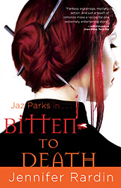
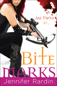
| Series: Jaz Parks #8 Date/Publisher: June 2nd 2011 by Orbit Cover Artist: N/A Cover Source: Wicked Scribes Abigail’s Thoughts: Jaz always looks fierce on these covers so it’s fitting that the series end with her armed to the tooth. Julia’s Thoughts: I love all of the Jaz Parks covers, and this one is one of the most militant yet. I think the cover for ONE MORE BITE is still my favorite, but this one is a nice addition. |  |




| Series: Bloodlines #1 Date/Publisher: August 23rd 2011 by Razorbill Cover Artist: N/A Cover Source: Shelf Life | EW.com Author Comments: yup--that's Sydney in there. You can spot her by the tattoo. The guy is the spurned love interest from Last Sacrifice, which I'm being enigmatic about simply because talking too much about him gives away the ending of that book. There are still lots who haven't read it, so we'll hold out a little longer. There are other characters in Bloodlines that I've mentioned before, like Eddie and Jill, but if you crowd too many on the cover there, it starts to look like an Olan Mills family photo shoot. (Are they even around anymore?). So, we just kept these two, but other characters will rotate through on other covers, I'm sure. Abigail’s Thoughts: Love the title detail, but not a fan of the rest. I didn’t ever love the VA covers either but I inhaled the series so hopefully I’ll love the spinoff just as much. Julia’s Thoughts: Creepy guy, creepy cheek detail, margins that look too blunt and PhotoShopped… |  |
From Author- Bloodlines is the spin-off series to Vampire Academy (it's the name of the first book and of the series). It's set in the VA world but will be about different characters: Sydney (our narrator), Jill, Eddie, and one of the love interests from VA. I'm not saying who that last guy is, but it's mostly to protect those who haven't read Last Sacrifice. If you have read it, then it should be pretty obvious who the other character is.
| Series: Black London novella Date/Publisher: Subterranean Press October 2011 Cover Artist: Ben Templesmith Cover Source: Caitlin Kittredge Author Comments: We’re still fiddling with cover fonts and stuff, but this is the artwork, by Ben Templesmith (who is, truth time, one of my favorite comic book artists.) Gaze upon it! It will give you magic powers! Abigail’s Thoughts: I like the idea of this look, but Jack looks like he’s about twelve here… Julia’s Thoughts: I couldn’t tell if this was a man or a woman, the graphic and shading on his shirt gives the suggestion of man boobs. A bit odd. | 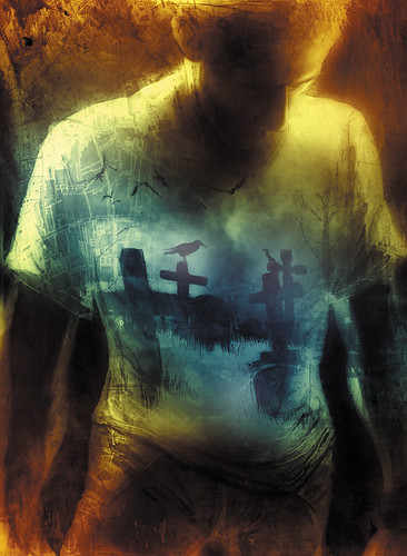 |

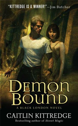

| Series: Black London #4 Date/Publisher: August 30th 2011 by St. Martin's Paperbacks Cover Artist: Chris McGrath Cover Source: Caitlin Kittredge Author Comments: The story inside certainly isn’t as pretty as that cover–all full of serial killer memorabilia, black magic sacrifices and smog as it is–but hopefully just as awesome. Abigail’s Thoughts: I love all the covers in this series. McGrath’s gritty style works so well here. I don’t know about the orange, but Jack is once again has that perfect blend of cool and hot. Julia’s Thoughts: I love this pair of cover models, and I particularly love that they’ve been maintained throughout this entire series. The heroine has a bit of a Wednesday Adams vibe, but it doesn’t detract from the over all cover. | 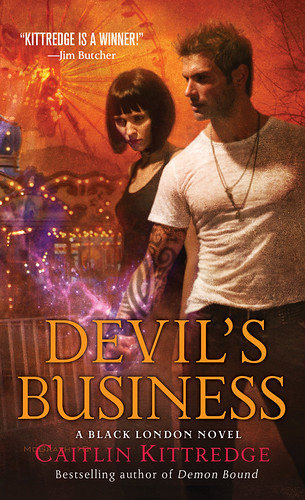 |
N/A
And our picks for this week’s Best & Worst…
| Best Cover | Worst Cover |
  |   |
Labels: cover art

Received For Review

|


Grab Our Button
 |
Sites & Info




Aw, I was hoping to see yer thoughts on the new Ann Aguirre cover. ^_^ Cuz that would totally be the best imo (unashamedly biased person here).
ReplyDeleteLots of good ones this week! I'll go with The Reapers are the Angels. So bleak but hauntingly beautiful.
The Faerie Ring has a neat effect. Love!
Love The Reapers Are the Angels and Faerie Ring, and definitely not a fan of the Bloodlines cover.
ReplyDeleteTemplesmith is a great artist and I like the image on the T-shirt but I agree with you about the man boobs thing...maybe the finished product will fix that, hope so!
Alisha - The Aguirre cover looks great, but I didn't include it because it's a scifi series.
ReplyDeleteVampires & Tofu - Yeah, that covers isn't quite right. I hope they can fix the final version.
Oh, that's right! Doi...::smacks forehead::
ReplyDeleteI love the Keri Arthur covers. They came out great.
ReplyDeleteSome of the others were nice and some were downright scary.
This is my first time commenting. While I love the book American Gods, I am not a big fan of the anniversary cover. It's actually not that different that my copy except there is a paved road on the bottom half of mine. And I think having that road along with the lightning is what I like about the cover. A small change but it makes a big difference in the overall feel of the cover.
ReplyDeleteThe Queen B - Recently they've been good, but I know what you mean about the scary :)
ReplyDeleteDawn - Hey thanks for commenting! I actually prefer the cover your talking about too. The differences are subtle, but like you said, they make a big difference
You seriously didn't like the Curse of Four's cover? It looks fabulous. At least, better than American Gods for sure.
ReplyDeleteI've never been partial to the Rardin covers. I just don't dig the white background. Even though I keep hearing great things about the series, the covers just don't inspire me to read them.
Jackie - The curse cover is sooooo different from the main series. And Jack looks like a kid. You don't think so?
ReplyDeleteThe Jaz series is pretty fun. I need to catch up, but I enjoy them. The covers are not for everyone but, what can I say? I dig the weapons :)
I like the new cover for The Reapers Are The Angels - more fitting to the story, though I don't think that girl exudes the gritty resourcefulness of the main character. Instead she looks lost and young and vulnerable...
ReplyDeleteLOVE the cover of The Faerie Ring - it is gorgeous!
So many good covers here! I´m in love with the Reapers are the angels one :)
ReplyDeleteDawn - I couldn't agree more regarding the American God's cover. I think my e-book version has the cover art you described, though I focused on the desert and open space alongside the road. Funny how everyone's eye picks up different details... The original is much more haunting, though, I agree with you.
ReplyDelete